fine art print, ladakh, india

Doorway to a Monastery, Ladakh – India

[et_pb_section fullwidth=”on” specialty=”off”][et_pb_fullwidth_header admin_label=”Fullwidth Header” title=”Doorway to a Monastery, Ladakh – India” background_layout=”dark” text_orientation=”left” header_fullscreen=”on” header_scroll_down=”on” background_url=”https://www.stopsoflight.com/wp-content/uploads/2013/11/fine-art-print-india-2006-07-20_CRW_9403.jpg” parallax=”off” parallax_method=”off” content_orientation=”center” image_orientation=”center” custom_button_one=”off” button_one_letter_spacing=”0″ button_one_use_icon=”default” button_one_icon_placement=”right” button_one_on_hover=”on” button_one_letter_spacing_hover=”0″ custom_button_two=”off” button_two_letter_spacing=”0″ button_two_use_icon=”default” button_two_icon_placement=”right” button_two_on_hover=”on” button_two_letter_spacing_hover=”0″ subhead=”Fine Art Print”]
[/et_pb_fullwidth_header][/et_pb_section][et_pb_section][et_pb_row][et_pb_column type=”1_3″][et_pb_image admin_label=”Image” src=”https://www.stopsoflight.com/wp-content/uploads/2013/11/fine-art-print-india-2006-07-20_CRW_9403.jpg” show_in_lightbox=”on” url_new_window=”off” animation=”left” sticky=”off” align=”left” force_fullwidth=”off” always_center_on_mobile=”on” use_border_color=”off” border_color=”#ffffff” border_style=”solid”] [/et_pb_image][/et_pb_column][et_pb_column type=”2_3″][et_pb_text admin_label=”Text” background_layout=”light” text_orientation=”left” use_border_color=”off” border_color=”#ffffff” border_style=”solid”]

The Making of A Doorway in Ladakh, India

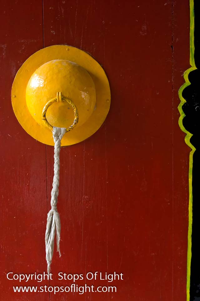
Color. I just can’t miss it. And color positively exploded from this freshly painted door leading to the courtyard of a monastery in Ladakh.

The Photograph

It was an overcast day, and that helped actually. The entire sky was like one big umbrella, diffusing the light and lighting everything evenly without casting shadows. Shapes were clearly delineated owing to the color contrasts, and the warm tones really helped. The picture, however, felt too heavy and weighted to the left, which is what led me to compose so as to include the thin strip of the black paint on the right. Overall, I really like this image; the vertical format and the warm hues signify strength, power and movement of sorts. Yet, the circular yellow shape balances that power out. Yellow is a friendly, inviting hue. The circle is a symbol of smoothness and infinity. Post-processing was minimal and restricted to boosting contrast a bit while saturating colors. Sharpening was added to bring out the texture in the rope and wooden door.

[/et_pb_text][/et_pb_column][/et_pb_row][et_pb_row][et_pb_column type=”4_4″][et_pb_text admin_label=”Text” background_layout=”light” text_orientation=”left” use_border_color=”off” border_color=”#ffffff” border_style=”solid”]

The Fine Art Print

This fine art photograph is available in two formats: (a) as a ready-to-hang mounted canvas print, and (b) a framed image printed on either canvas or Fine Art Paper.

The print is available in three size styles: Decorator (12×18), Collector (16×24), and Connoisseur (20×30). Sizes are in U.S. inches and are approximate.

[/et_pb_text][/et_pb_column][/et_pb_row][/et_pb_section]
fine art print - kashi - the city of light

Kashi – The City Of Light #1

[et_pb_section fullwidth=”on” specialty=”off”][et_pb_fullwidth_post_title admin_label=”Fullwidth Post Title” title=”on” meta=”on” author=”on” date=”on” categories=”on” comments=”off” featured_image=”on” featured_placement=”above” parallax_effect=”on” parallax_method=”on” text_orientation=”center” text_color=”dark” text_background=”on” text_bg_color=”#d6a34b” module_bg_color=”rgba(255,255,255,0)” title_all_caps=”off” use_border_color=”off” border_color=”#ffffff” border_style=”solid”] [/et_pb_fullwidth_post_title][/et_pb_section][et_pb_section][et_pb_row][et_pb_column type=”4_4″][et_pb_text admin_label=”Text” background_layout=”light” text_orientation=”left” use_border_color=”off” border_color=”#ffffff” border_style=”solid”]

The Making of  “Kashi – The City Of Light #1”

“You don’t make a photograph just with a camera. You bring to the act of photography all the pictures you have seen, the books you have read, the music you have heard, the people you have loved.” ~ Ansel Adams

On the banks of the river Ganges in the state of Uttar Pradesh in India stands the spiritual capital of India. Its many names include “the city of temples”, “the holy city of India”, “the religious capital of India”, “the city of lights”, “the city of learning”, “the oldest living city on earth”. It is more commonly known as “Varanasi” and also “Benares”. But the only name that really does justice to it is the original name mentioned in the scriptures: Kashi – The City of Light.

Kashi is said to have been founded by the Great God Shiva, who is said to be eternally present here along with his consort Parvati. Kashi is home to over 23000 temples and is one of the most important places of pilgrimage for practitioners of the Hindu faith who flock here to perform their rituals and bathe in the holy river Ganges. Life in Kashi hence rotates around its temples and the bathing ghats (flight of steps) that lead to the holy river.

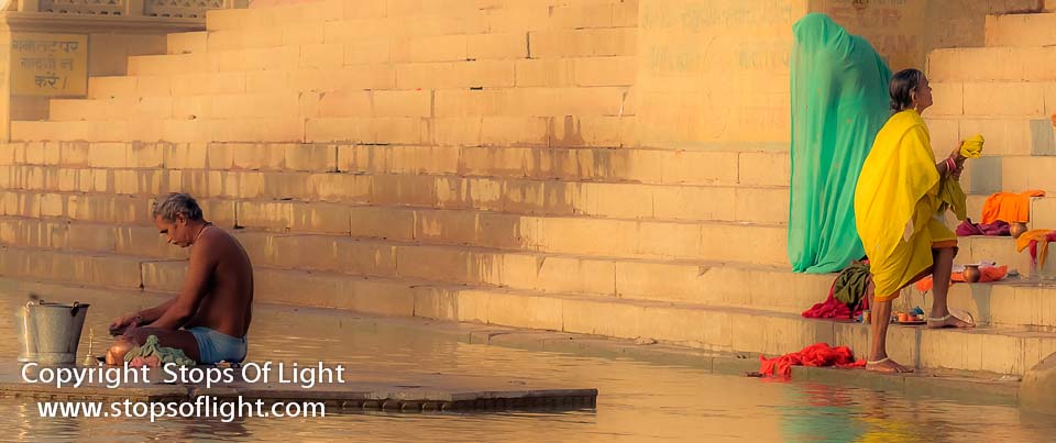
In the making of this photograph, I was primarily driven by a couple of factors. Driven as I am by my quest for Light, Color and Contrast, it was natural that I was drawn to what I saw unfolding before me. The intensity of the colors, the glow of light off the steps in the background, the contrast and juxtaposition of the players in the scene all screamed out to be photographed. And therein lies a story…

Central to hindu philosophy are the terms Purusha and Prakriti. Purusha is the self (spirit/soul), Prakriti is matter/energy. They are quite similar to the concepts of Yin and Yang in Taoist thought, seemingly opposite forces which are actually complementary parts of the same unified whole.

Shiva – The Lord of Kashi – is Purusha personified. As  the supreme renunciant,  he is not given to action. He does not participate in the going-ons of the world. He merely sits and observes. His wife Parvati on the other hand is the very energy that drives everything to action; she is Nature, she is Movement. She is Prakriti personified.

Stillness and Movement. Male and Female. Yang and Yin. Purusha & Prakriti. Seeming opposites, but in reality the material world cannot exist without the play of both. Just as it is contrast that makes an image, so is it that this play of seeming opposites makes the world and Life so interesting.

The Photograph

This image.  I must say,  is one of my favourites. Gorgeous colours, light to die for, brilliant composition, perfect moment, outstanding post-processing. This photograph does not look like a photograph at all. Rather, it comes across as a painting.

This photograph is all about contrast. Contrast of colors, contrast of subjects, contrast of movement and stillness, contrast of genders. It is perhaps apt that  for the first time I truly viscerally felt how the play of opposites is vital to the balance of an image as it is to life; how apt that it should occur at a location that is the very soul of India’s hindu faith!

In post-processing I gave this image an impressionist feel, the better to convey the City of Light aspect of Kashi.

The Fine Art Print

This photograph is available in two formats: (a) as a ready-to-hang mounted canvas print, and (b) a framed image printed on either canvas or Fine Art Paper. Owing to the nature and post-processing used, I personally recommend option (a).

The print is available in two style sizes: Panoramic Collector (20″×8.35″), and Panoramic Gallery (32″×13.4″). Sizes are in U.S. inches and are approximate. Please view the Pricing Guide – Images in Panoramic Format below for pricing details.

All materials used in the printing and framing process are acid free, making the print especially resistant to aging. Prints are produced using the highest quality papers / canvases using the best inks possible.

[/et_pb_text][/et_pb_column][/et_pb_row][/et_pb_section]
Buddha Is In The Details

[et_pb_section fullwidth=”on” specialty=”off”][et_pb_fullwidth_post_title admin_label=”Fullwidth Post Title” title=”on” meta=”on” author=”on” date=”on” categories=”on” comments=”off” featured_image=”on” featured_placement=”above” parallax_effect=”on” parallax_method=”on” text_orientation=”center” text_color=”dark” text_background=”on” text_bg_color=”#feb972″ module_bg_color=”rgba(255,255,255,0)” title_all_caps=”off” use_border_color=”off” border_color=”#ffffff” border_style=”solid” /][/et_pb_section][et_pb_section][et_pb_row][et_pb_column type=”4_4″][et_pb_text admin_label=”Text” background_layout=”light” text_orientation=”left” use_border_color=”off” border_color=”#ffffff” border_style=”solid”]

The Making of “Buddha Is In The Details”

The Middle Path or Middle Way is the expression the Buddha used in his first discourse to describe the Noble Eightfold Path to achieve enlightenment. Put simply, it eschewed the taking of extremes.

Visually, that for me spells as “take too long a view, and you’re liable to miss out on the finer details. Take too short a view and you won’t get the larger picture.”

The Photograph

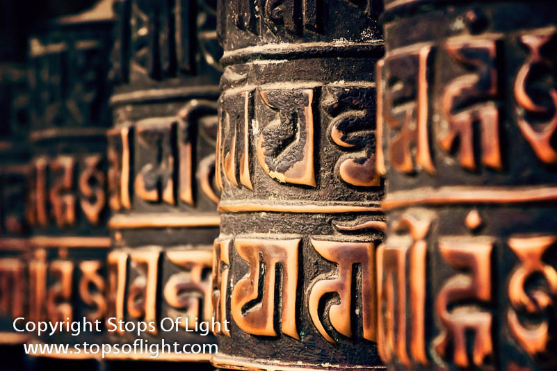
This is one of my favorite images, in no small measure because of the above mentioned “Middle Way” approach that I took to photographing it. I was drawn by the repeating pattern of prayer wheels leading into the distance, as I was by the earthy hues. Closer examination of the subject revealed textures that I felt were vital to conveying what I felt about what needed to be conveyed: that true balance is a fine line we need to skirt between what is close and what is distant.

By bunching myself against the prayer wheels I filled the frame with them. By focusing on the middle one, I ensured I had enough scope to let the depth-of-field drop off in a fashion that gave coherence to the image. I focused on the details, yet implied similarity and continuity by the repetition of patterns.

In post-processing I chose to accentuate texture by deliberate over-sharpening. I also chose to accentuate the earthy tones during the process.

The Print

This fine art photograph is available in two formats: (a) as a ready-to-hang mounted canvas print, and (b) a framed image printed on either canvas or Fine Art Paper.

The print is available in five size formats: Decorator, Collector, Connoisseur, Gallery, and Masterpiece. Sizes are in U.S. inches and are approximate.

All materials used in the printing and framing process are acid free, making the print especially resistant to aging. Prints are produced using the highest quality papers / canvases using the best inks possible.

To purchase this Fine Art Photograph, please contact us.

[/et_pb_text][/et_pb_column][/et_pb_row][/et_pb_section]
Wah, Taj!

[et_pb_section fullwidth=”on” specialty=”off”][et_pb_fullwidth_post_title admin_label=”Fullwidth Post Title” title=”on” meta=”on” author=”on” date=”on” categories=”on” comments=”off” featured_image=”on” featured_placement=”above” parallax_effect=”on” parallax_method=”on” text_orientation=”center” text_color=”dark” text_background=”on” text_bg_color=”#ffa700″ module_bg_color=”rgba(255,255,255,0)” title_all_caps=”off” use_border_color=”off” border_color=”#ffffff” border_style=”solid”] [/et_pb_fullwidth_post_title][/et_pb_section][et_pb_section][et_pb_row][et_pb_column type=”4_4″][et_pb_text admin_label=”Text” background_layout=”light” text_orientation=”left” use_border_color=”off” border_color=”#ffffff” border_style=”solid”]

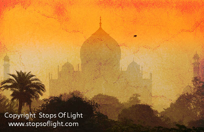
 The Making of  “Wah, Taj!”

Who hasn’t heard of it? That most wonderful Monument to Love. One of  The Seven Wonders of  The World. The One and only Taj Mahal…

Photographing it would be a breeze. If it weren’t for the fact that it ranks among one of the most photographed monuments on the face of the planet. And personally, I do dislike making cliche photographs – that’s just not my style – a photograph must be uniquely me – my personal vision, my personal style…

I made this photograph on the last day on one of my annual Five Stops of Light India Photography Tour. Before sunrise, my workshop participants and I headed off  to this vantage point I’d discovered. We then waited for the sun to rise and the fog to clear. The former did, the latter didn’t seem to be in much of a mood to cooperate. I finally decided to trip the shutter as a bird flew across the frame, knowing that I wouldn’t have any detail in the structure itself worth writing home about; but that wasn’t my purpose anyway. As I mentioned, the cliche image just isn’t my style – my focus here was to capture the shape of the structure which is what I did.

In post-processing I boosted contrast to accentuate the shape of the Taj as well as the foliage in the foreground. I also applied a nice warm-yellow graduated filter (the better to give a warm, inviting feel to the image). In ending, I added a texture to the image to give it that weathered and cracked feel of an old parchment. My aim was to try and recreate the magic felt by those early western explorers — the awe they must have experienced upon finally breaking through the jungle and setting eyes on this truly magnificent building for the first time.

[/et_pb_text][/et_pb_column][/et_pb_row][/et_pb_section]