[et_pb_section fullwidth=”on” specialty=”off”][et_pb_fullwidth_post_title admin_label=”Fullwidth Post Title” title=”on” meta=”on” author=”on” date=”on” categories=”on” comments=”on” featured_image=”on” featured_placement=”above” parallax_effect=”on” parallax_method=”on” text_orientation=”center” text_color=”light” text_background=”on” text_bg_color=”#6f3530″ module_bg_color=”rgba(255,255,255,0)” title_all_caps=”off” use_border_color=”off” border_color=”#ffffff” border_style=”solid”] [/et_pb_fullwidth_post_title][/et_pb_section][et_pb_section][et_pb_row][et_pb_column type=”4_4″][et_pb_text admin_label=”Text” background_layout=”light” text_orientation=”left” use_border_color=”off” border_color=”#ffffff” border_style=”solid”]
The Making of “Pattern, broken – Varanasi”
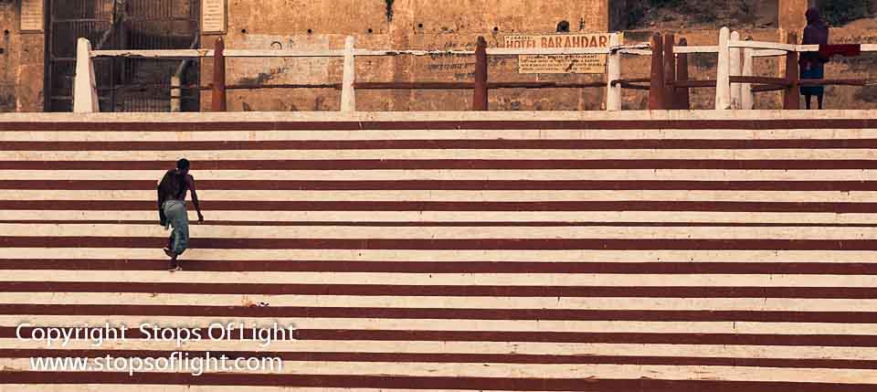
As I mention in my Artist Statement, one of the driving forces in my fine art photography is Contrast; and it was the contrast at play here – between lines horizontal & vertical – that made me raise camera to eye and trip the shutter.
The place was Varanasi, India. The event – one of the photography workshops and tours. My guests and I were at the fag end of our boat ride on the river Ganges when I saw this man walking up a flight of stairs on the ghats after taking a dip in the river Ganges.
Now there’s nothing extraordinary about a man walking up a flight of steps that would prompt one to raise camera to eye, let alone spending precious time in processing to end up with a brilliant fine art photograph. Nothing at all, if I hadn’t seen what played out in front of me differently…
This photograph is all about horizontal lines, you just can’t miss them. A pattern of sweeping row upon row of red and white bands make this panoramic fine art print ideal for wide walls. And then that pattern is broken, and that is what really makes this image work: The small yet so very significant visual impact of what is essentially a vertical shape across those horizontal lines.
In post-processing, I actually added a bit of black to the reds (deepening them) so as to ensure that that particular colour did not end up taking away from the man; red has that impact – it is an attention-grabber if ever there was one, and one must know when to do what with it. I also accentuated the lines that define the shapes of everything but the steps themselves, the better to make them stand out. The end result is a fine art photograph that looks like an impressionist painting with some of the shapes (such as that of the man) emphasized by the use of charcoal on their edges.
[/et_pb_text][/et_pb_column][/et_pb_row][/et_pb_section]
